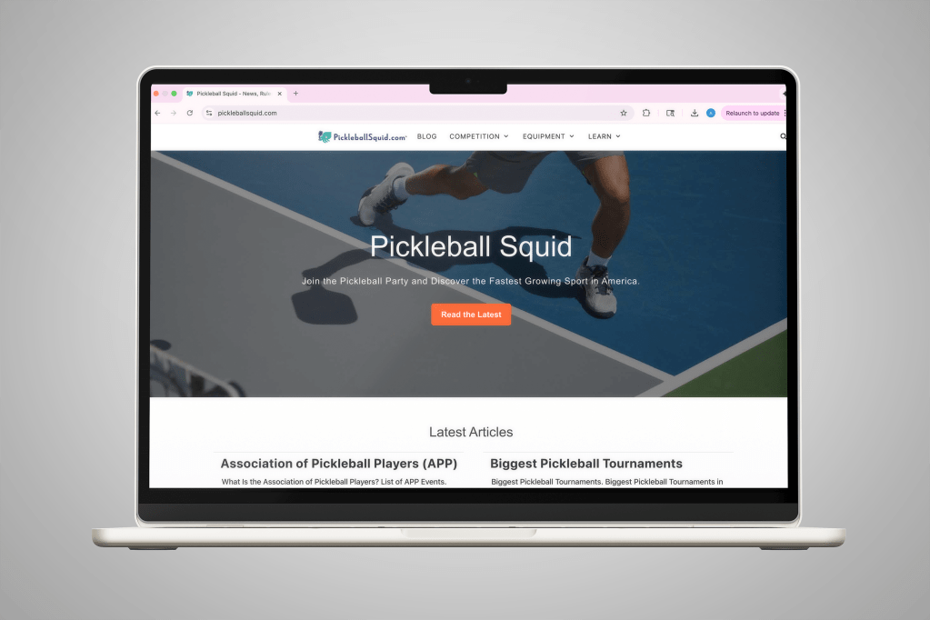
I created a comprehensive branding guide for a pickleballsquid.com, a site dedicated to providing accurate and easy to understand information about this popular sport.
Early Development
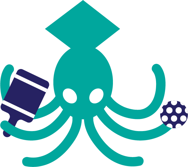
After receiving the task, I got to work narrowing the branding direction. Because pickleball is popular with all ages I wanted this brand to speak to a wide variety of users. Because of this, I decided to lean into the fun and friendly aspects of the game, rather than the competitive ones. This shows in the final designs, as the character is comprised of soft shapes, bright colors, and a friendly face.
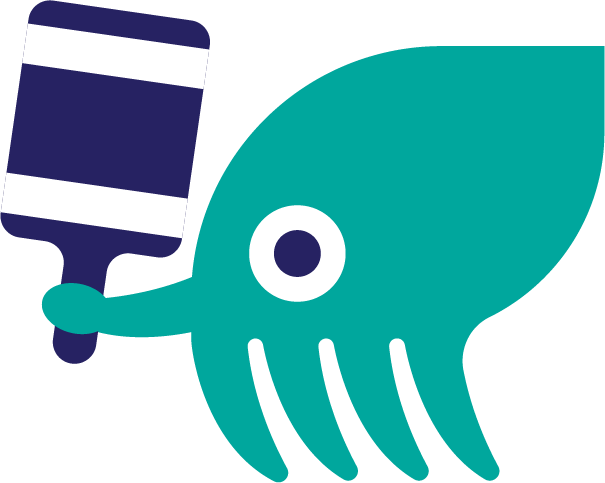
Here are some of my initial designs where I explored what character could look like:

I also went through various fonts:


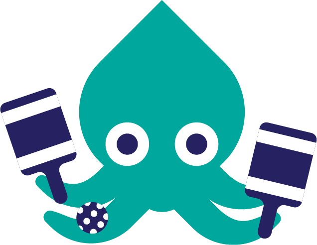
Final Branding
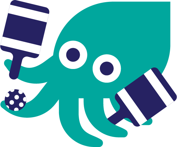
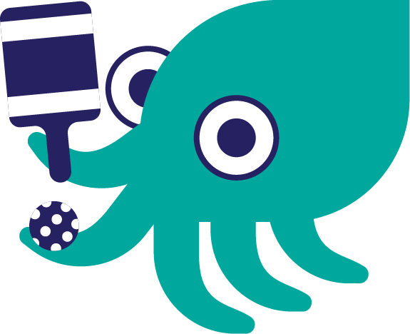
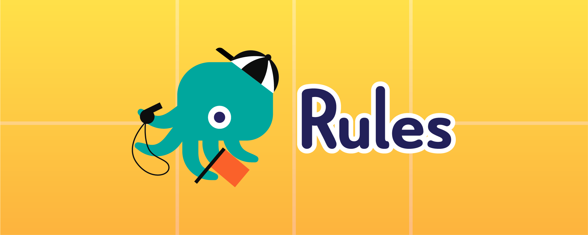
We decided to a simple, side profile view of the squid, juggling multiple paddles. This character is fun, and visually easy to understand for any age group. The font is Le Havre Rounded. These worked well together because the rounded nature of the font reflected the arms of the squid. I created a variety of other characters to use on different sections of the website such as Rules, Learn, and Championships.


Deliverables
Website logo:

Site section header images:


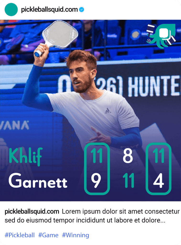
Instagram Post: